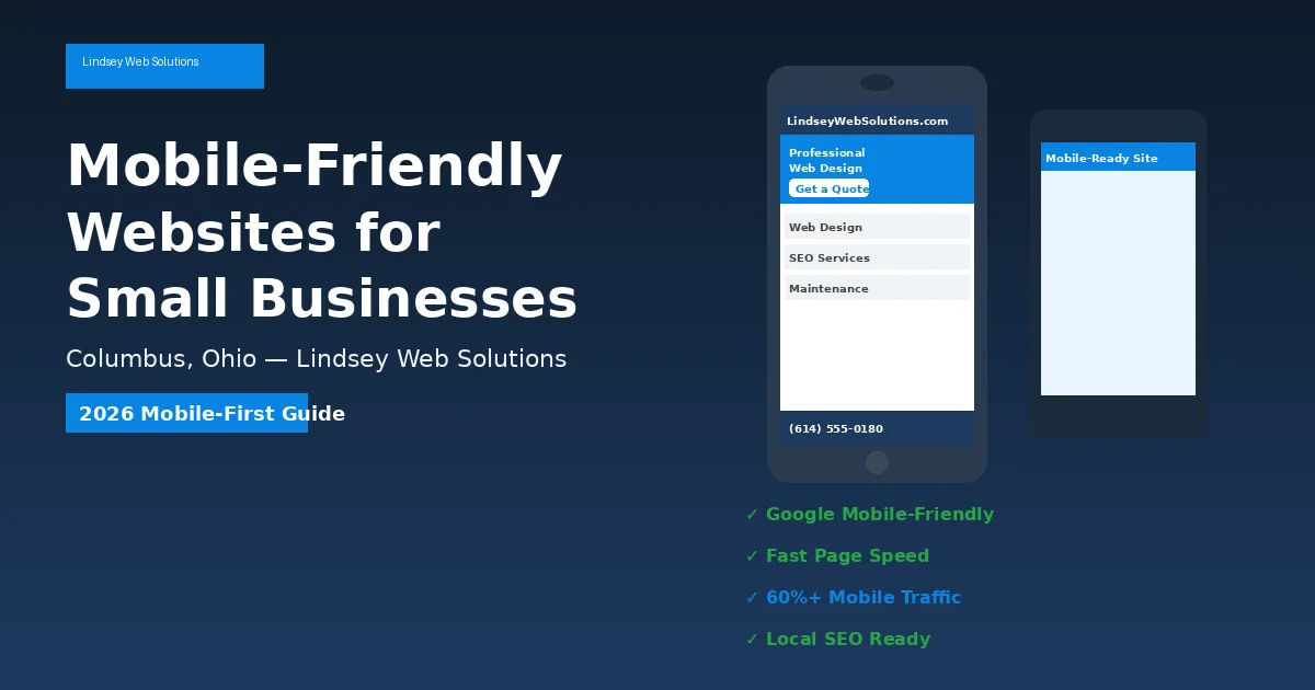
Why Your Small Business Website Needs to Be Mobile-Friendly in 2026 (And How to Fix It)
Pull out your phone and open your business website. Don’t use your desktop computer — use the same device your customers are holding right now. Is your phone number clickable? Do your images fit the screen without side-scrolling? Can someone book an appointment or request a quote with their thumb?
Related resource: If you found this helpful, see our guide on website redesign signs.
If the answer to any of those questions is “no,” you have a mobile-friendliness problem. And in 2026, that is the same as having a revenue problem.
Mobile devices now account for approximately 64.35% of all global website traffic as of mid-2025, according to StatCounter. In the United States, roughly half of all web browsing happens on smartphones. For local service businesses — restaurants, salons, law firms, contractors, dental offices — the percentage is often higher because customers search for services while they are out and about, not sitting at a desk.
Also read: Learn more about what you need to know about web design for additional strategies.
Google has been using mobile-first indexing for years, which means Google evaluates your site based on how it performs on a phone, not a laptop. If your mobile experience is slow, broken, or frustrating, Google assumes your entire site is low quality — and buries you in the search results.
This guide will help you understand what “mobile-friendly” actually means, how to spot problems on your own site, and what steps to take to fix them.
What “Mobile-Friendly” Actually Means
Many small business owners think their website is mobile-friendly because it “looks okay” on a phone. But looking okay and working well are two different things.
A truly mobile-friendly website meets these standards:
- Responsive layout: The design automatically adjusts to fit any screen size without horizontal scrolling or zooming.
- Readable text: Font sizes are large enough to read without pinching to zoom. Google recommends a base font size of at least 16 pixels for body text on mobile.
- Tap-friendly targets: Buttons and links are large enough and spaced far enough apart that users don’t accidentally tap the wrong thing.
- Fast load times: Pages load in under 3 seconds on a standard 4G connection.
- Accessible navigation: Menus collapse into a simple hamburger menu or thumb-friendly layout. No tiny dropdowns that require surgical precision.
- Clickable contact info: Phone numbers are tap-to-call, addresses open maps, and email links open the user’s mail app.
- No intrusive pop-ups: Full-screen interstitials that cover the content are penalized by Google and frustrate mobile users.
If your site is missing even two or three of these elements, visitors are leaving before they ever learn what you offer.
The Real Numbers: Why Mobile Matters for Small Businesses
The business case for mobile optimization is not theoretical. It is backed by hard data from Google, BrightLocal, and other research organizations.
Consider these statistics:
- 53% of mobile users abandon a website that takes longer than 3 seconds to load (Google, 2023). That means if your homepage is heavy with uncompressed images or bloated code, you are losing more than half your potential customers before they even see your services.
- Only 22% of small business websites are fully mobile-optimized (BrightLocal, 2024). If you invest in mobile-friendliness, you are immediately ahead of roughly 78% of your local competitors.
- 67% of mobile users are more likely to buy from a business with a mobile-friendly site (Google, 2023). A smooth mobile experience doesn’t just keep people on your site — it directly increases the chance they become paying customers.
Imagine a local restaurant owner whose site takes 8 seconds to load on a smartphone. A hungry customer searching for “Italian food near me” clicks the link, waits, sees a blank screen, and immediately hits the back button to try the next result. That customer is gone forever — and the restaurant owner never even knows they had a chance.
The same scenario plays out every day for contractors, auto shops, fitness studios, and salons across Columbus and every other city. Mobile-friendliness is not a “nice-to-have” design feature. It is the front door to your business.
5 Signs Your Website Isn’t Actually Mobile-Friendly
You don’t need to be a developer to spot mobile problems. Here are five red flags you can check right now on your own phone:
1. You Have to Pinch and Zoom to Read Anything
If text, images, or buttons overflow the screen width, your site is not responsive. This is the most obvious sign of a mobile problem — and the one Google penalizes most heavily.
2. Your Navigation Menu Is Impossible to Use
Desktop-style dropdown menus with tiny links are a nightmare on touchscreens. If you find yourself tapping the wrong menu item three times in a row, your customers are doing the same — and leaving.
3. Your Forms Are Longer Than the Screen
Contact forms that require excessive typing or that don’t adapt to mobile keyboards (showing a number pad for phone fields, for example) create friction. Every extra field reduces conversion rates.
4. Images Take Forever to Load
Uncompressed photos from a professional camera can be 3–5 megabytes each. On mobile networks, those images crawl onto the screen. If you see blank boxes or slowly loading galleries, your image optimization needs work.
5. Your Call-to-Action Buttons Are Tiny or Missing
On mobile, your primary action — “Call Now,” “Book Appointment,” “Get a Quote” — should be thumb-sized and impossible to miss. If users have to hunt for how to contact you, they won’t.
Mobile-Friendly vs. Mobile-First: What’s the Difference?
These terms get used interchangeably, but they mean different things — and the difference matters for your search rankings.
| Factor | Mobile-Friendly | Mobile-First |
|---|---|---|
| Approach | Desktop site is adapted to also work on mobile | Mobile experience is designed first; desktop scales up |
| Performance priority | Often slower on mobile because desktop assets load first | Fast by default because mobile constraints drive decisions |
| Content hierarchy | Same content as desktop, just shrunk | Content is prioritized for mobile users’ immediate needs |
| SEO impact | Meets minimum Google requirements | Aligns with Google’s mobile-first indexing; stronger ranking signal |
| User experience | Functional but often clunky | Optimized for touch, speed, and on-the-go behavior |
| Best for | Budget-conscious short-term fixes | New websites and serious growth-focused businesses |
If your website was built more than five years ago, it is probably mobile-friendly at best. A true mobile-first redesign — where the entire architecture is built around the smartphone experience — is what separates businesses that rank on page one from businesses buried on page five.
How to Make Your Small Business Website Mobile-Friendly
The good news is that mobile optimization is not an all-or-nothing project. You can tackle the highest-impact fixes first and work your way down the list.
Start With Speed
Speed is the single biggest mobile ranking factor and the biggest driver of abandonment. Prioritize these fixes:
- Compress every image. Use tools like TinyPNG or Squoosh to reduce file sizes to under 150KB without visible quality loss.
- Enable browser caching. This lets returning visitors load your site faster because their browser stores static files locally.
- Minimize plugins and scripts. Every social media widget, chat box, and analytics tracker adds load time. Remove anything that isn’t actively driving conversions.
- Use a content delivery network (CDN). A CDN stores copies of your site on servers around the world, reducing the distance data has to travel to reach your visitor’s phone.
Simplify Your Design
Mobile screens are small. Clutter kills conversions.
- Use a single-column layout on mobile.
- Limit your homepage to one clear headline, one sentence describing what you do, one proof point (reviews or years in business), and one call-to-action.
- Eliminate carousels and auto-playing videos. They slow load times and most users never interact with them.
- Make your phone number a sticky button at the bottom of the screen so it is always one tap away.
Fix Your Forms
Mobile keyboards are annoying. Reduce the pain:
- Only ask for information you absolutely need. Name, phone, and service type are usually enough for a first contact.
- Use the correct input types so the right keyboard appears (number pad for phone, email keyboard for email).
- Enable autocomplete so returning users can fill forms in two taps.
Test on Real Devices
Don’t just shrink your browser window and call it done. Test on an actual iPhone and an actual Android phone. The two platforms render websites differently, and you need to look good on both.
How to Test Your Site Right Now
You don’t need to hire anyone to find out if your site has mobile problems. These free tools will diagnose issues in under 60 seconds:
- Google’s Mobile-Friendly Test: Enter your URL and Google will tell you exactly what it sees wrong with your mobile experience. It is the same test Google uses to evaluate your site for rankings.
- Google PageSpeed Insights: Scores your mobile speed and gives you a prioritized list of fixes, from image compression to script optimization.
- WebsiteLinter.com: Our free automated website health checker analyzes your site for mobile performance issues, SEO problems, accessibility violations, and security vulnerabilities. It generates an actionable report you can hand to any developer — or to us for a free consultation.
Run all three tests. If your scores are below 50 on mobile speed, or if Google’s Mobile-Friendly Test returns warnings, you have work to do.
The Bottom Line for Columbus Small Businesses
Central Ohio is competitive. Whether you run a salon in the Short North, a dental practice in Dublin, a law firm in New Albany, or a restaurant in Westerville, your customers are searching for you on their phones — usually while they are ready to make a decision.
If your website frustrates them, they will not give you a second chance. They will tap the next search result. But if your site loads fast, looks professional, and makes it effortless to call or book, you have already won half the battle before they ever walk through your door.
Mobile-friendliness is not about keeping up with design trends. It is about respecting your customers’ time and removing every obstacle between their first click and their first purchase.
Need Help Making Your Site Mobile-Friendly?
At Lindsey Web Solutions, we build mobile-first websites for small businesses across Columbus and Central Ohio. Every site we design is tested on real devices, optimized for Google’s Core Web Vitals, and built to turn smartphone visitors into paying customers.
If your current site is failing the mobile test — or if you are not sure where to start — we offer free consultations with no obligation. We’ll run a full mobile performance audit, show you exactly what’s broken, and give you a clear plan to fix it.
Get your free mobile website audit →
Related Reading
- our complete web design & development hub
- website redesign signs
- what you need to know about web design
Ready to take the next step? our website design services with Lindsey Web Solutions, Columbus OH.
Need Help With Your Website?
At Lindsey Web Solutions, we build fast, secure, mobile-friendly websites for Columbus, Ohio small businesses — and we keep them running with ongoing maintenance, security monitoring, and local SEO.
Just a figure


